UNIT 1.4 - LANDSCAPE
Landscape photography refers to photographic scenes that are predominately about the physical landscape and, although this may involve people, the focus is the environment.

Minor White
"Minor White is one of the masters of photographic modernism. Throughout his career, White sought to photograph things not only for what they are but also for what they may suggest, and his pictures teem with symbolic and metaphorical allusions. Coming of age when homosexuality was socially unacceptable, White sought comfort in a variety of Western and Eastern religious practices. Photography became both a way to make visible his ongoing search for spiritual transcendence and a medium through which he could express his sexual desire for men. White's work was highly influential to a generation of photographers and still resonates today. "

I like this picture because I like how the clouds blend in with everything in the picture. I also like how the black sky is the same colour as the hut and how all of the colours in the picture compliment each other. I like how the hut is the main focus of the image and how the shape represents the small life on earth with the sky above being so open and wide, shining down onto the ground.
|

This picture is one of my favourites taken by Minor White as I feel it has a very sharp and warm contrast. I also like how you can see the sun
sun rays are shining down onto the mountains making them stand out even more. The river at the bottom right of the image is eye catching because it is lit up by the sun ray's beaming down onto the water creating a reflective tone to the ripples of the water. |

I like this picture because I like how
the shadow of the crane is reflected onto the ground and how the whole picture is complimented by the simple, effective use of colour. I also like the strange different shades of colours in the sky as it creates an illusional look. I like the way that White has positioned this photo with the huts in the centre of the photo as it doesn't take away any details of the photo and everything has their own individual purpose. |
Karen Hoyt


|
In this photograph, I like how the colours all compliment each other and how the lamp post light is the only source of light in the whole picture lighting up the building below. I also light how behind the trees you have three different shades of colours in the sky creating a sunset look. The use of a sort of sepia effect on this image as it represents the night coming to an end and creates a quiet, lonely environment.
|
This image is one of my favourites because I like how the spotlights are the only things that are making the picture have light. Having the light around the gas station in the sky pitch black makes the cars, gas tanks and roof of the gas station stand out and if it's almost a luminous colour. Having the gas station lit up makes it the main focus of the picture which I feel is clever of Hoyt as all of the details in the photo don't go unrecognised.
|
In this image I like how all the main colours are red with a bit of black here and there. I like how the lights, sky, building and floors colours all compliment each other and I especially like how you can see a reflection of some lamp post poles on the ground. This image creates a vibrant feel to the overall picture. The use of the dark affect in the sky is clever as it makes the building stand out and makes it the central focus.
|
Charles sheeler


|
I like this image because I like the way it has loads of different formal elements in it like pattern and layers etc. I also like how the colours are all the same and how there is a shadow affect on some of the objects in this image. The way that some of the objects overlap each other is effective as it makes some of them more visible and more in focus than the others.
|
This picture is one of my favourites because I like the way Sheeler positioned the way that the photo was taken and how the top middle of the picture catches your eye which immediately makes you want to review the image and observe all the different types of detail. I like the effect of this image as it creates an ancient look with the faint sepia filter and rusty rough effects on some of the objets.
|
I like this image because I like how much texture, contrast and pattern is shown in the photo. I also find the way the clouds are positioned very adequate as some are very low down along with some that are high up. Also, the way that each of the colours in the picture all compliment each other creates an alluring effect. The opacity being quite low on the clouds opens up and lets the background image of the building show through them as the opacity setting lightens the image and almost fades it a bit.
|
John Divola
John Divola is a concurrent visual artist who currently lives and works in Riverside. Divola works in photography and describes himself as 'exploring the landscape by looking for the edge between abstract and specific.'

|

|

|
|
I like the image because I like the way everything is positioned and the way the photo is taken. I also like the 'inside/outside' effect because inside one picture, an inside environment and an outside environment is shown, using just a window to break up the space from inside the room to outside. I also like the way that in the outside environment, the view is of the sun setting which gives a warm and catching touch to the photo.
|
I chose this image to analyse because it caught my eye when I was searching for John Divola's photos.
I think that the main reason as to why this caught my eye is because of the bright blue sky and sea in the outside enviroment and the different coloured paint spots on the ceiling but also the blue and white paint on the wall making a letter 'v'. This image is one of my favourites because it has its own unique features and objects in it, just like each of Divola's photos which I think is what makes them so good and interesting. |
I like this image because I like how there is one main colour so everything is balanced and then the black squiggly lines on the wall make the image eye catching and affective. I also like how the blue sea water compliments the blue walls and completes image.
|
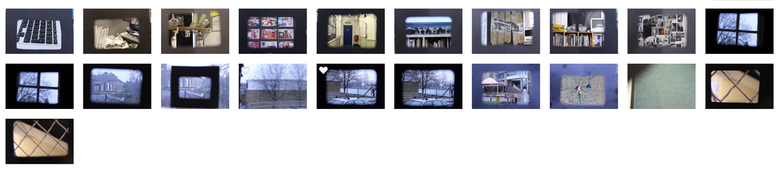
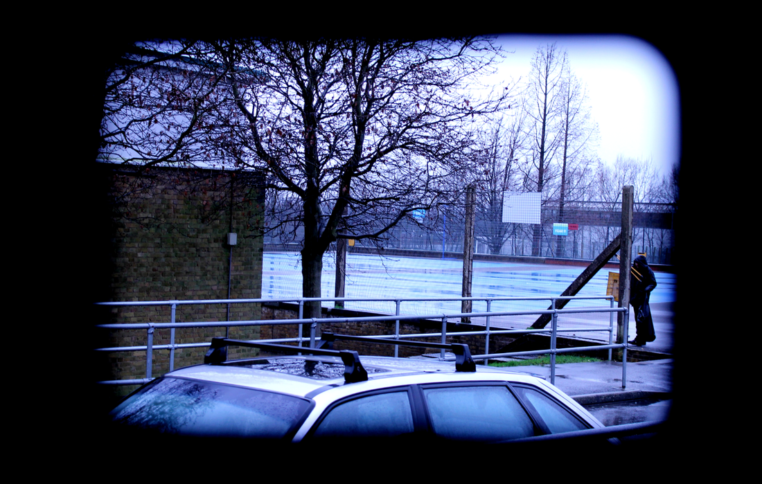
Framing Task
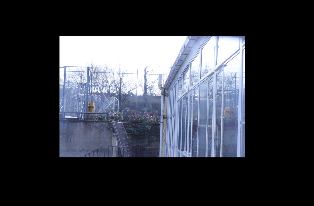
For this Framing Task, I have gone round my school with a piece of paper cut out like a frame and held it up in front of the camera.
First Response
Second Response
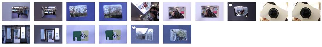
Initial Shoot around school
Here are some of the pictures that I took in the first lesson that we started this new unit in:


David Hockney
David Hockney is a famous artist and is very well known for his montages that create a sense of movement and altered perspective, playing with time and space.
Here are some of Hockney's panographies.
Here are some of Hockney's panographies.


Panography
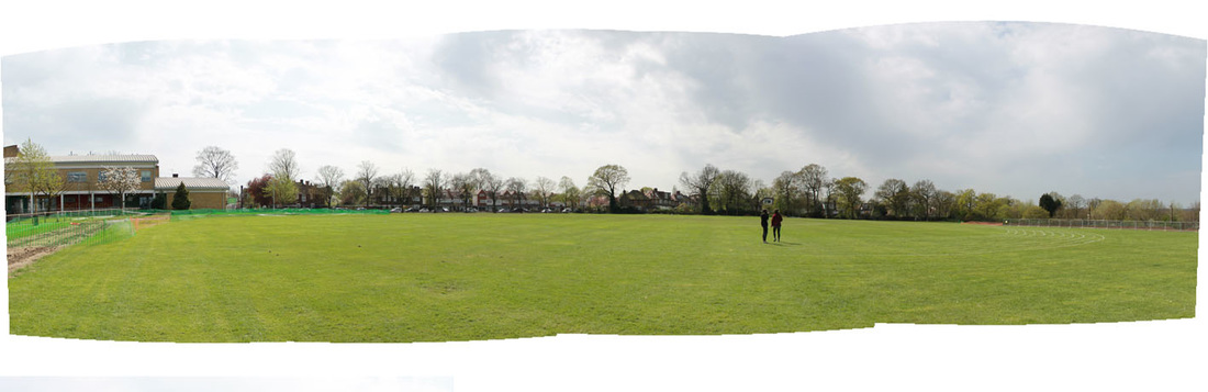
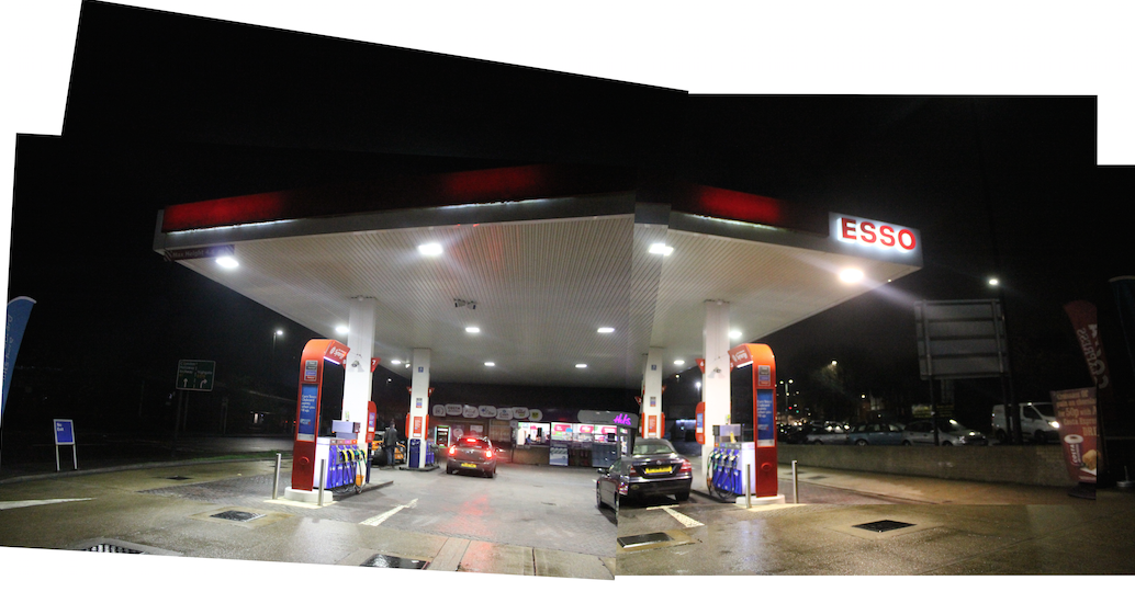
A photographic panography is a montage of images composited together to make a whole. The artist David Hockney is famous for his montages or how some people say it as joiners, that create a sense of movement and altered perspective, playing with time and space on the first lesson that we looked at panography, we went out to South Wing and Tetherdown and then North Wing on another lesson which our different ares around my school and took multiple pictures of different levels and layers. I then documented the pictures using a simple process on Adobe Photoshop to stitch together my layers into a montage/joiner.
To do this process on photoshop I used the following steps-
1) I went to File>Automate>Photomerge. When the window opened, I unticked blend as I wanted the final image to have a collage feel to it. Then I clicked browse to find and select all the images I wanted to use for my joiner.
2) When the photos had been overlapped and created a collage-style I wanted to try turning different layers on or off to see if they added or detracted from the image. I also made some adjustments to individual layers for example the brightness.
3) I wanted to make each image stand out so I added a shadow by double clicking on the fx button at the bottom of the layers pallet. You can also change the capacity, angle, distance, spread and size of the shadow but I felt the need that I didn't need to.
4) I then thought that my image needed more definition so I clicked on the fx button and went to 'pick stroke'. I changed the colour to white and change the size, position and opacity of the line.
5) I could of then went through each individual layer adding the stoke and shadow affect using the same settings for each of the layers by holding down the Alt key, clicking on the fx logo thats on the top layer and dragging it down to the next layer and would repeat this until the layers had the logo on them.
6) I then added a background colour to my collage by creating a new layer and filling the layer with the colour I chose which was white using the fill tool.
I also watched a video which is down below which was on on creating the joiner on photoshop just to get a visual idea on doing it.
Panograpghy Classwork Response
For this response I went round South Wing area in my school and took pictures to create a Panography. A photographic panography is a montage of images composited together to make a whole. The artist David Hockney is famous for his montages that create a sense of movement and altered perspective, playing with time and space. I will document an area using a similar process of recording and use Photoshop to stitch together my layers into a montage.


2nd Panography Homework Response
For this response I will do exactly the same thing as what I did in my first response but I will photograph in different locations.


The Formal Elements
In these tasks, I racticed taking photos by focusing on some of the formal elements, a term which is used by artists within the fine arts, to refer to the elements within a composition.
Task 1
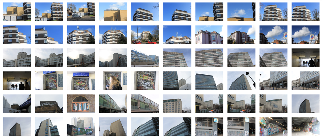
For this task, we went around North Wing area in my school and captured images which I thought could illustrate the eight formal elements that are Perspective, Layer, Texture, Focus, Negative Space, Pattern, Scale and Contrast.
Here are the pictures I took today:
Here are the pictures I took today:


Task 2
For this task, I chose two out of the eight formal elements to focus on. The two formal elements that I chose to focus on were Negative Space and Pattern.
Here are my images
Here are my images


Homework task
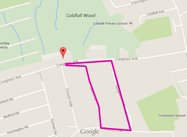
For this homework I designed a 30minute walking route in my local area and followed it whilst taking pictures that I feel show a strong understanding of three of the formal elements. The three formal elements that I have chose to work with are, Pattern, Perspective and Texture.
Here is the route that I planned and walked.
Here is the route that I planned and walked.
Here are my pictures that I took


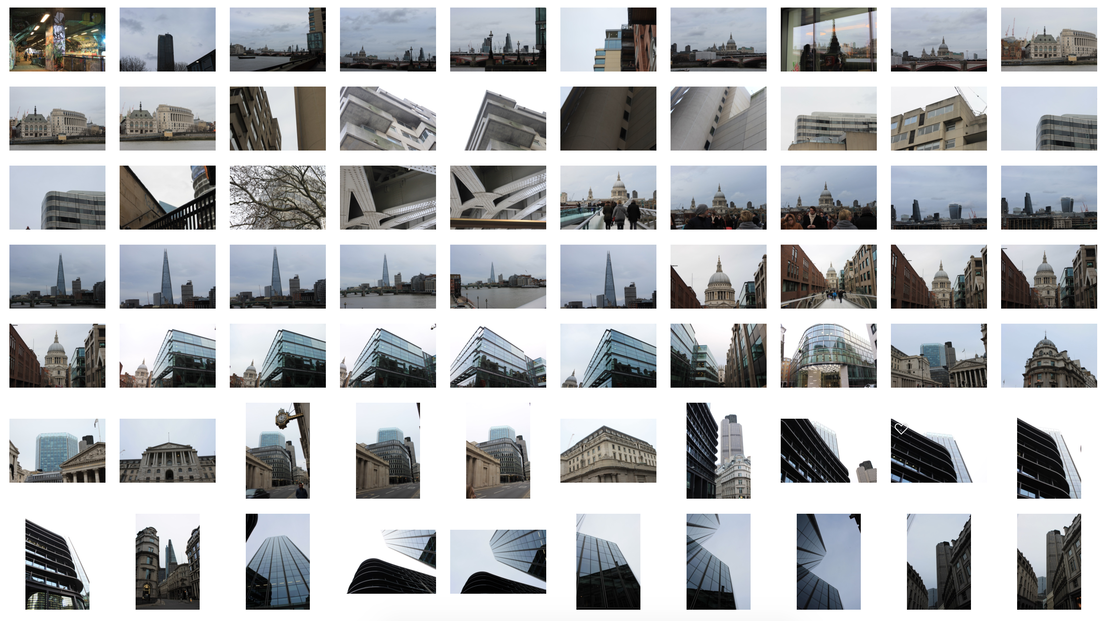
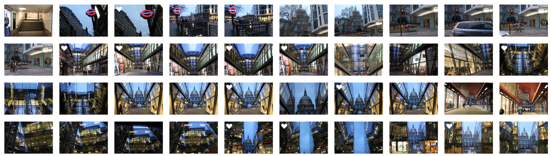
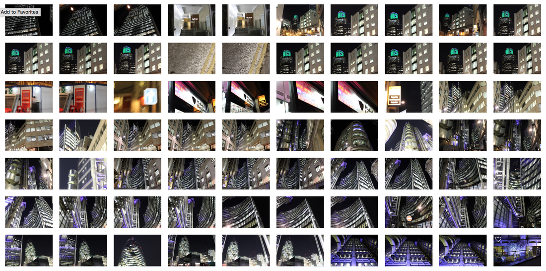
Landscape development - My London
For the second part of this Landscape project, we had to produce a series of images that show a particular place or aspect of London that is relevant to me. I chose to look at Landscape, Skyline and Long Exposure in London.
Task 1
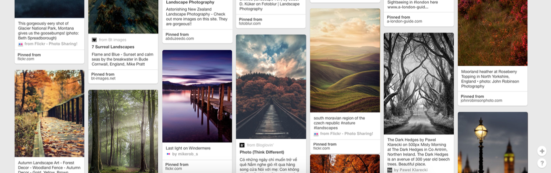
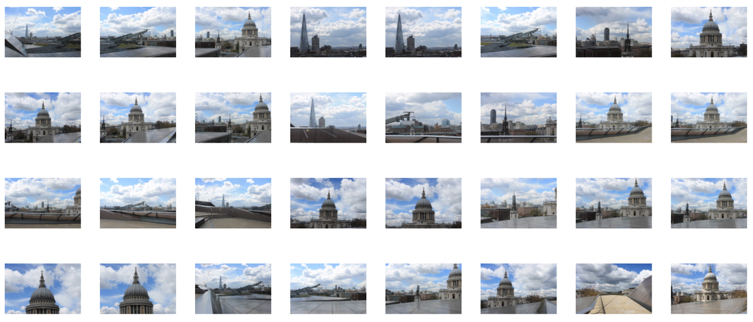
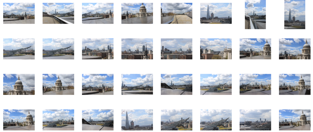
For this task I collected 10 different photos that I feel inspire me and are relevant to the theme (landscape and skyline) that I have chosen which is Landscape, Long Exposure (traffic movement) and Skyline from Overhead.


Task 2
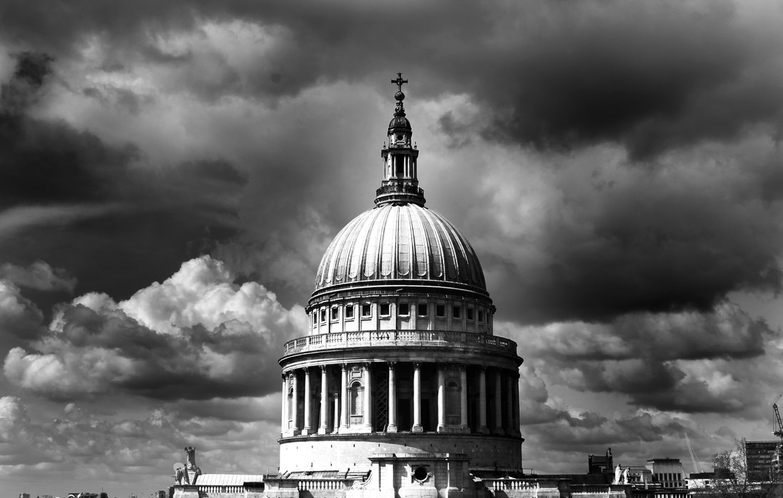
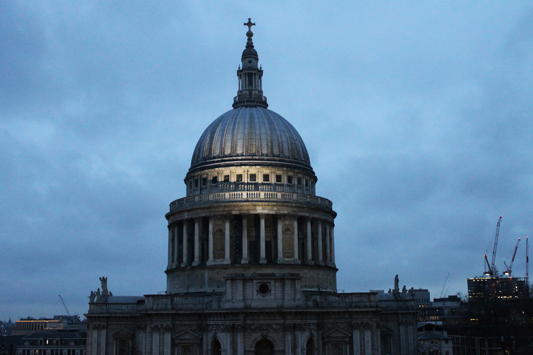
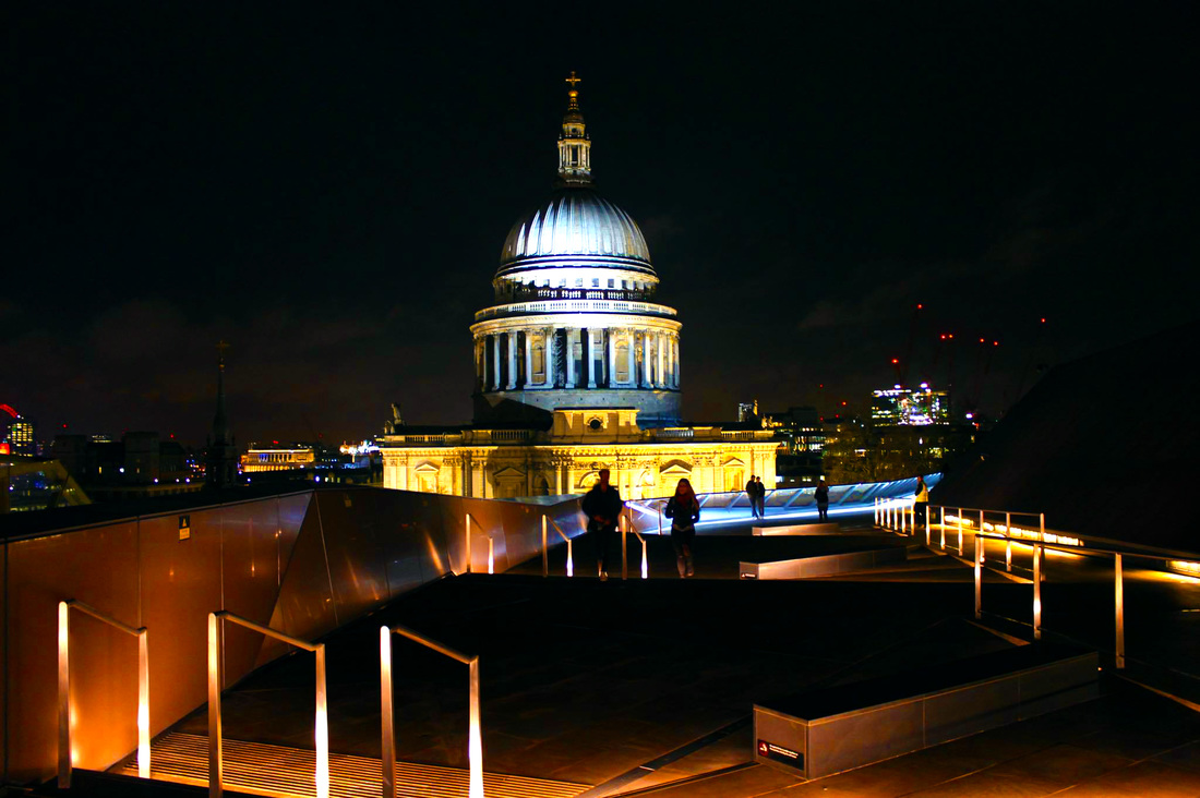
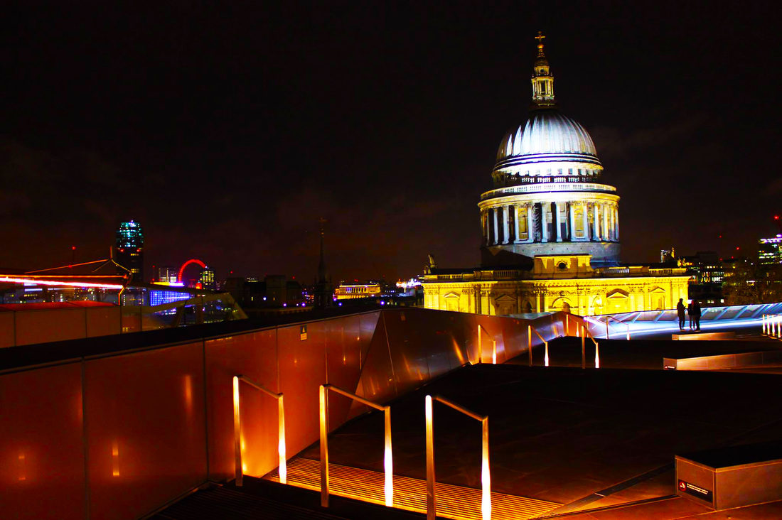
I have chosen to do a further analysation on this photo as I feel it represents London very well.
|
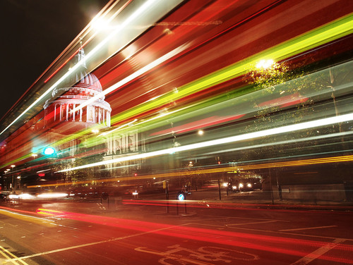
Name - Nicholas Good
Title- St Paul's Cathedral Date- *unknown* Country- London, United Kingdom This picture is one of my favourites that is taken by Nicholas Good as I feel that it represents the busy, bright, long and fast travelled nights in the City of London and I also like how The top of St Paul's Cathedral is shown. Nicholas Good used colour very well as he used many different ones that all compliment each other and really make it look realistic. Nicholas Good created this photo by having similar camera settings to Aperture: F/22, Shutter Speed: 13/1, ISO Speed: 100 and Flash: Not Fired. Having these settings are very helpful as traffic head light and tail light trails give a beautiful effect and they are a great way to get acquainted with long exposure times. This picture shows a formal element like Texture. This affect contributes to the image as it shows a lot of detail and makes the photo more interesting. |
Task 3
For this task, I had to outline three ideas for my response to the theme. The ideas that I have chosen to give me an idea of what I want to do for my final response are, 1) Movement 2) Overhead & Below Views
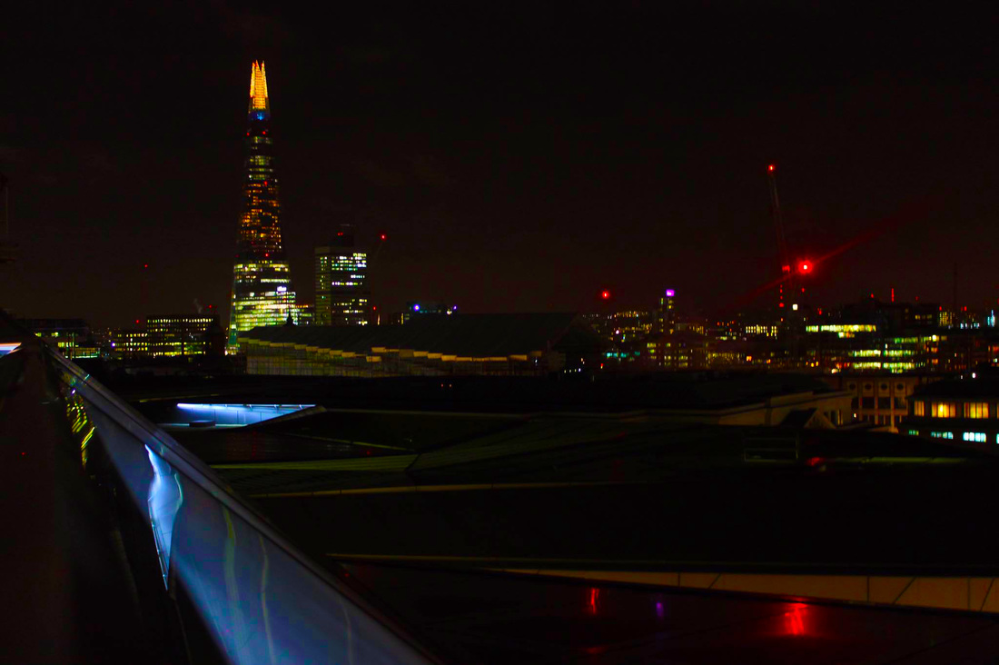
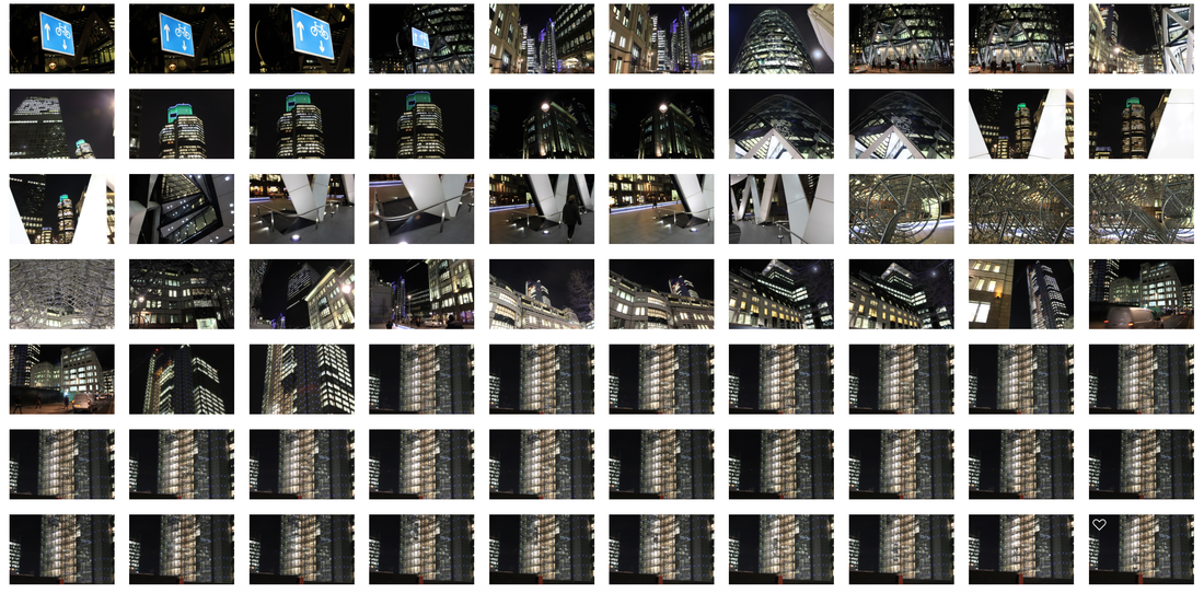
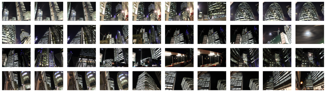
Views from Above -
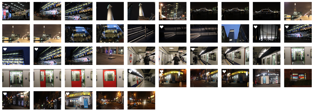
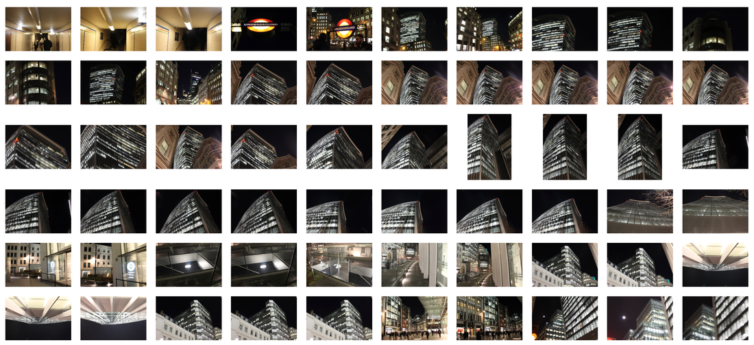
To present photos that show the Overhead views of buildings in London, I went to various different locations at night to demonstrate the lights, tallness and amount of buildings there are in London.
To present photos that show the Overhead views of buildings in London, I went to various different locations at night to demonstrate the lights, tallness and amount of buildings there are in London.


Movement-
To show long exposure in London I would like to go all around South Bank and Tower Bridge as there are a lot of lights along South Bank and lots of cars and busses that go up and down Tower Bridge every second of everyday.
Here are some of the photos that I would like to take-
To show long exposure in London I would like to go all around South Bank and Tower Bridge as there are a lot of lights along South Bank and lots of cars and busses that go up and down Tower Bridge every second of everyday.
Here are some of the photos that I would like to take-


My Response
STRAND 1
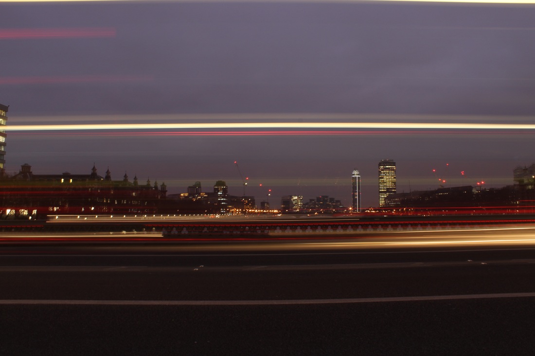
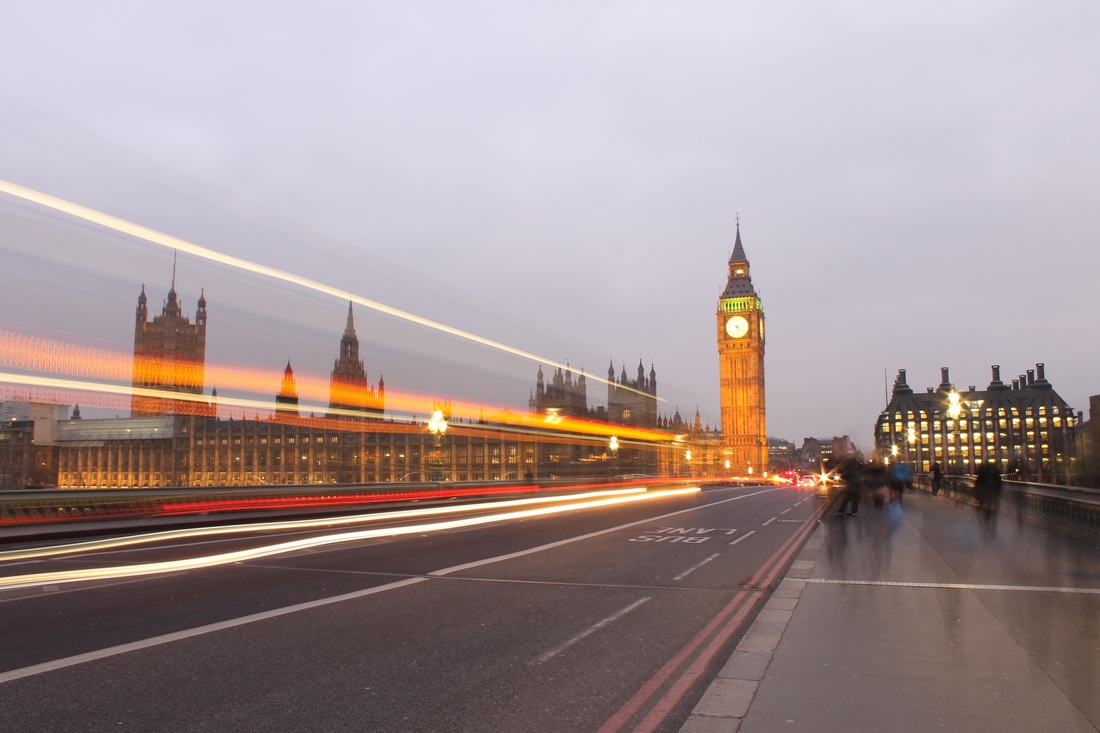
FIRST RESPONSE - MOVEMENT
I chose to do Movement as my first response as I feel like it represents London best as it shows bright lights, multiple car trails and buildings, as the background of the photos are some of London's top landmarks.


PHOTOGRAPHER THAT INSPIRED ME TO TAKE THE PHOTOS THAT I TOOK :
Chris McIntosh
I think that the reason why Chris McIntosh's photos had a very positive impact on me is because I feel that they really represent London well, the bright lights, traffic and rushing people everywhere. It also represents the amazing buildings and monuments that we have here in London. Here are three photos that really motivated and interested me in taking photos of movement in London.


Artist & Me
Chris McIntosh Me

Christ McIntosh's picture here is along a bridge just off of Southbank with Big Ben near the middle position of the wide shot. He has put his camera on a long exposure so he can capture the movement of some vehicles as they go by his camera. It is important to use a tripod when taking these images as you want your photo to come out steady, clear, straight and also allow it to be in one position to capture a vehicles lights and create a straight, smooth curve of a line whilst your lens is open, capturing the photograph.
|
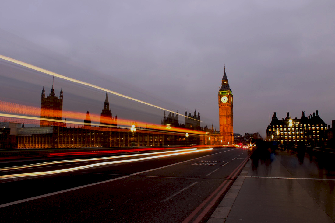
My photo is similar to McIntosh's as I have gone to the same bridge as him and also set my camera on a long exposure to capture the vehicles movements and light. However, mine is slightly different as there were people walking passed me so I had captured their movement on the right side of the photo. I took a slightly wider image as my lens was more zoomed out. I really like the way these long exposure photos come out as I love seeing the light trails that cars and busses have left behind as they pass you and the camera.
|
Strand 2
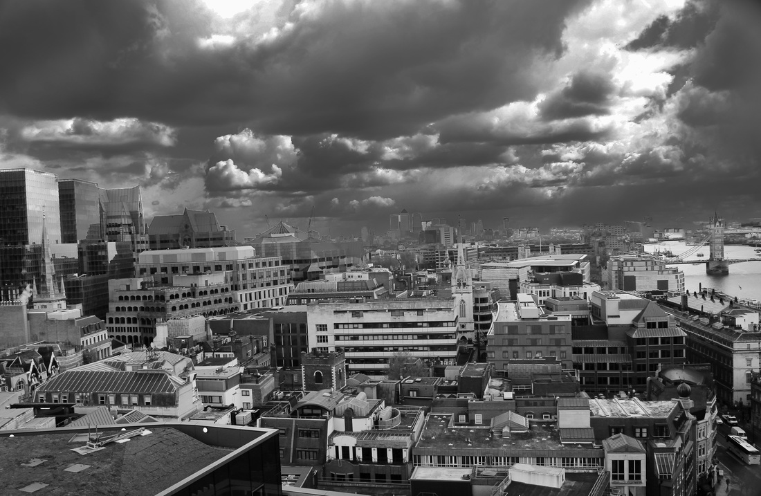
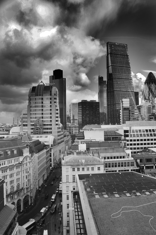
First Response - Views from Above
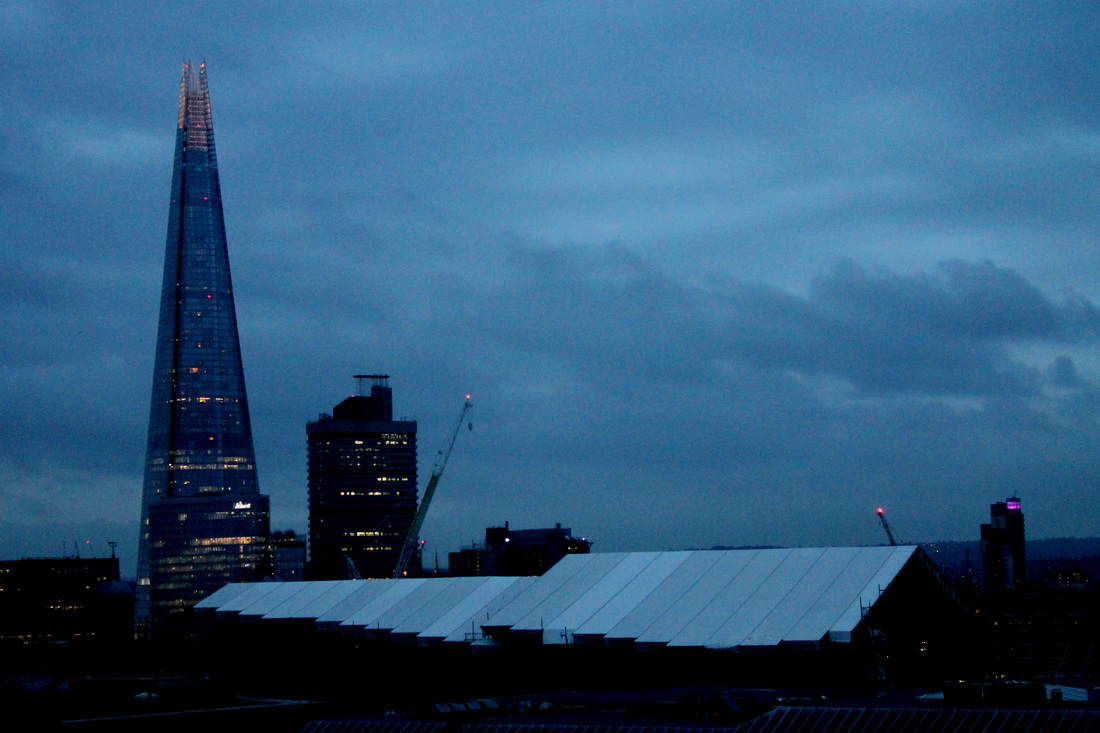
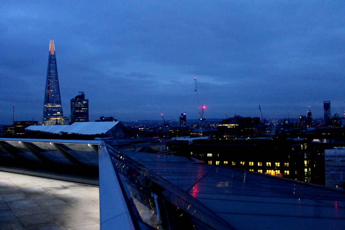
First Response - Views from Above
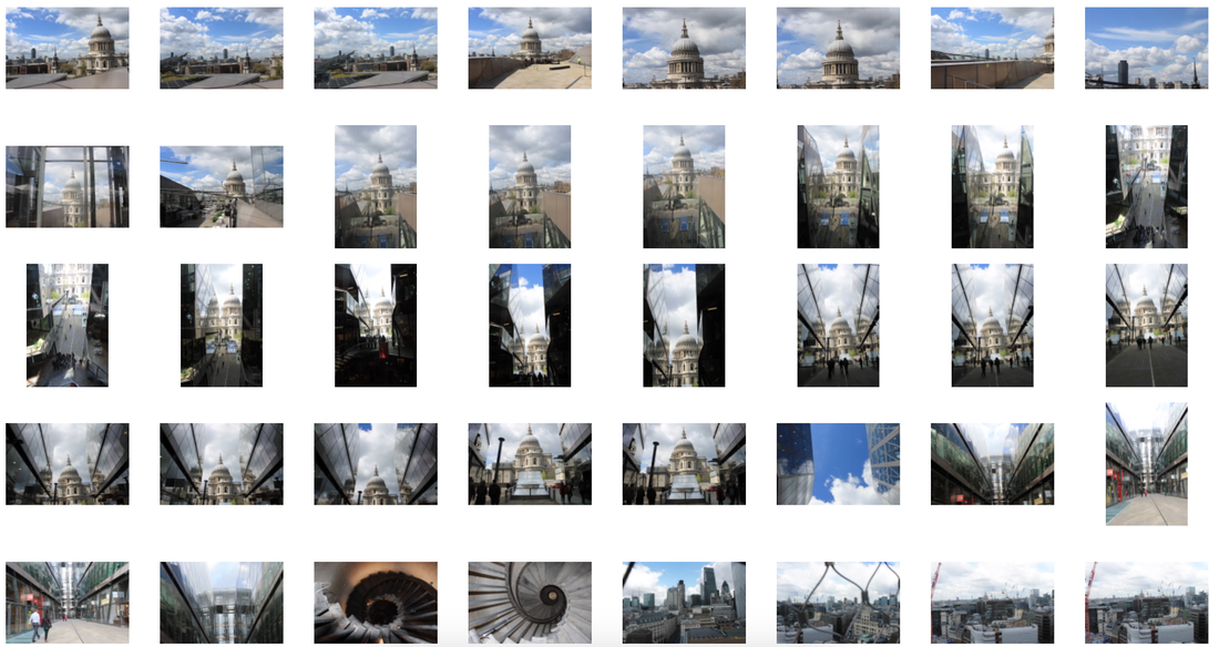
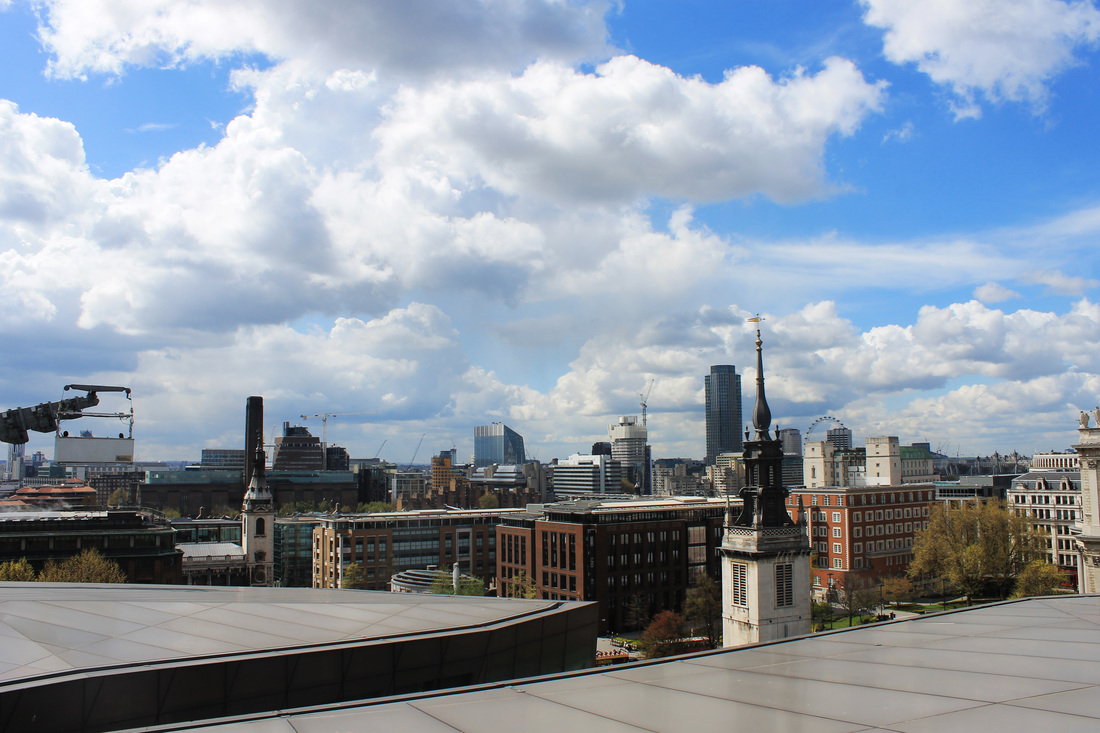
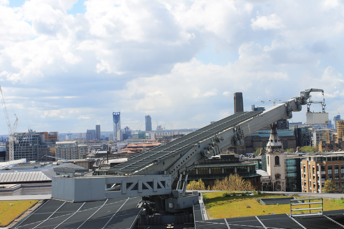
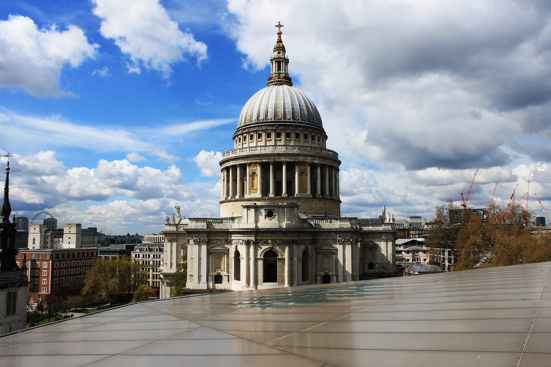
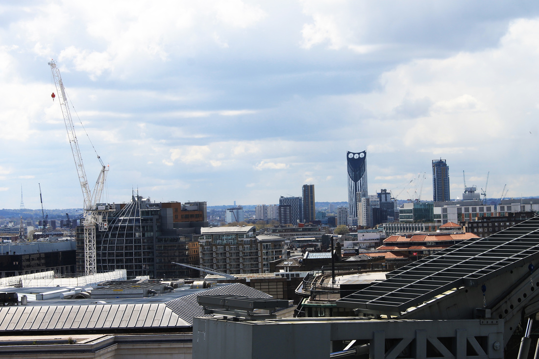
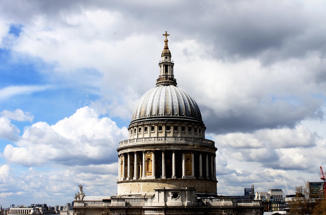
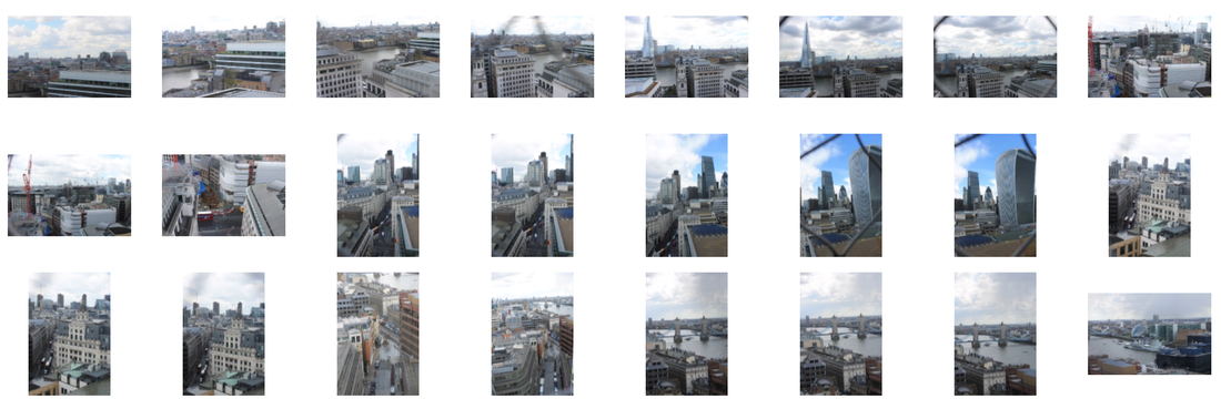
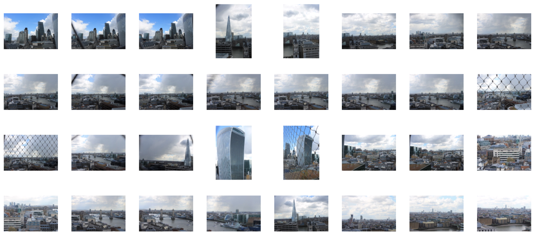
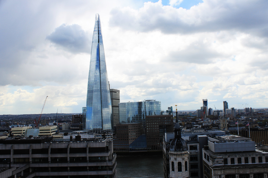
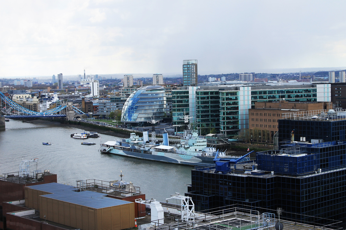
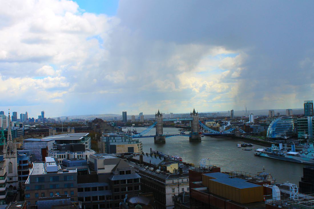
For this response I went to tall buildings in London, went to the top of them and photographed my view of the city. I felt like this would be a good response as it really shows the beauty, size and colour of London itself.


|

|

|
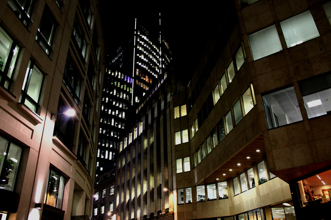
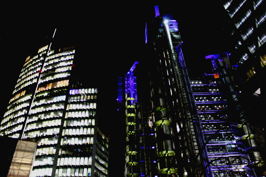
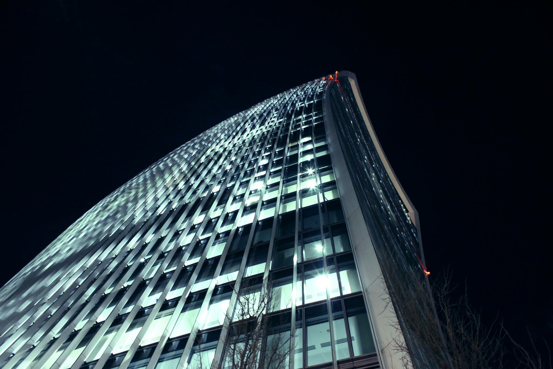
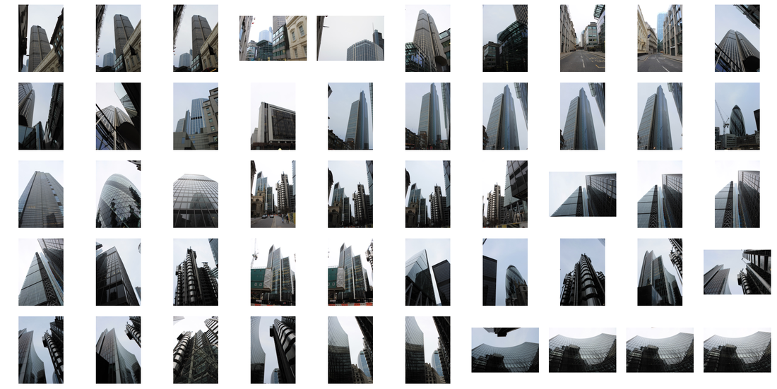
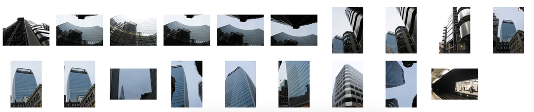
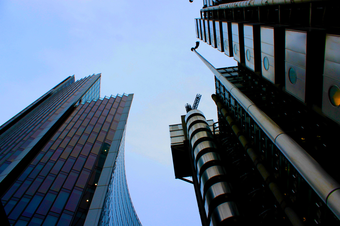
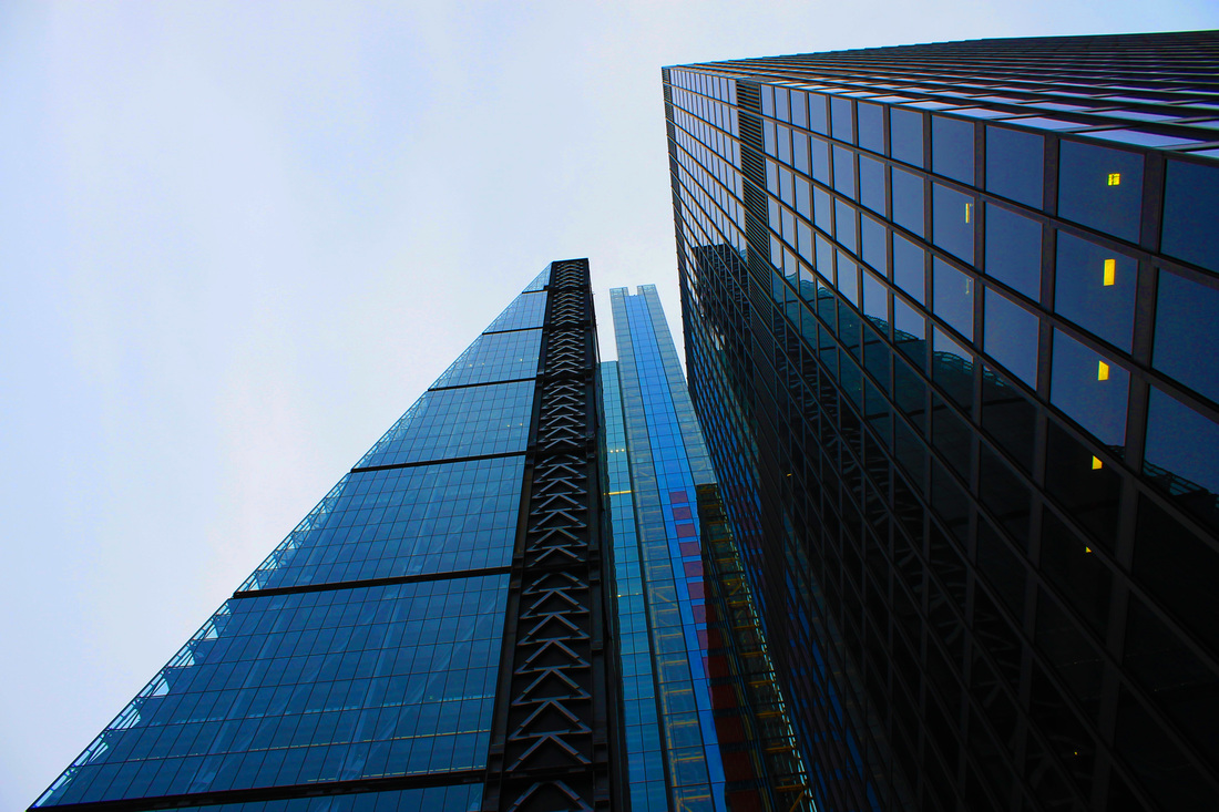
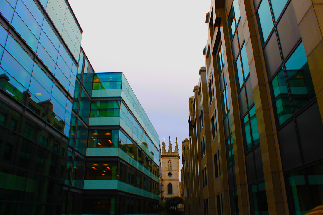
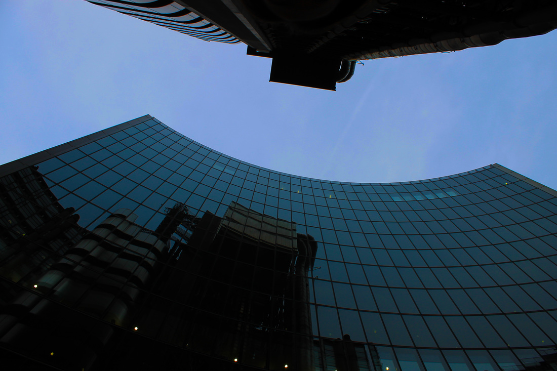
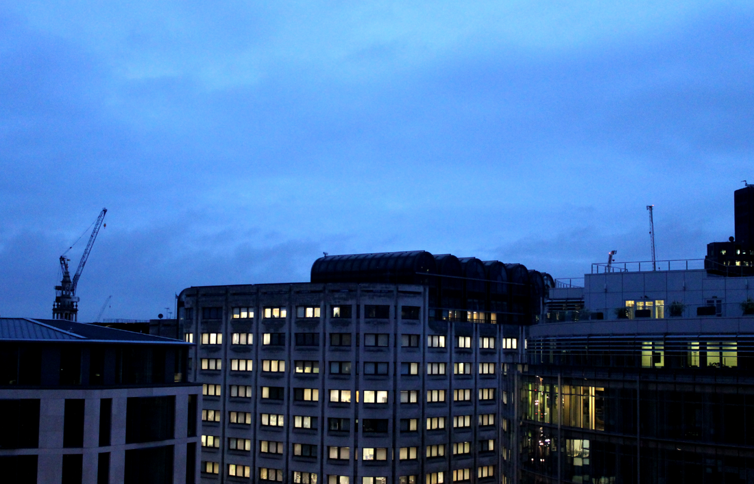
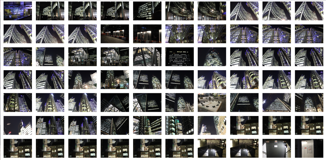
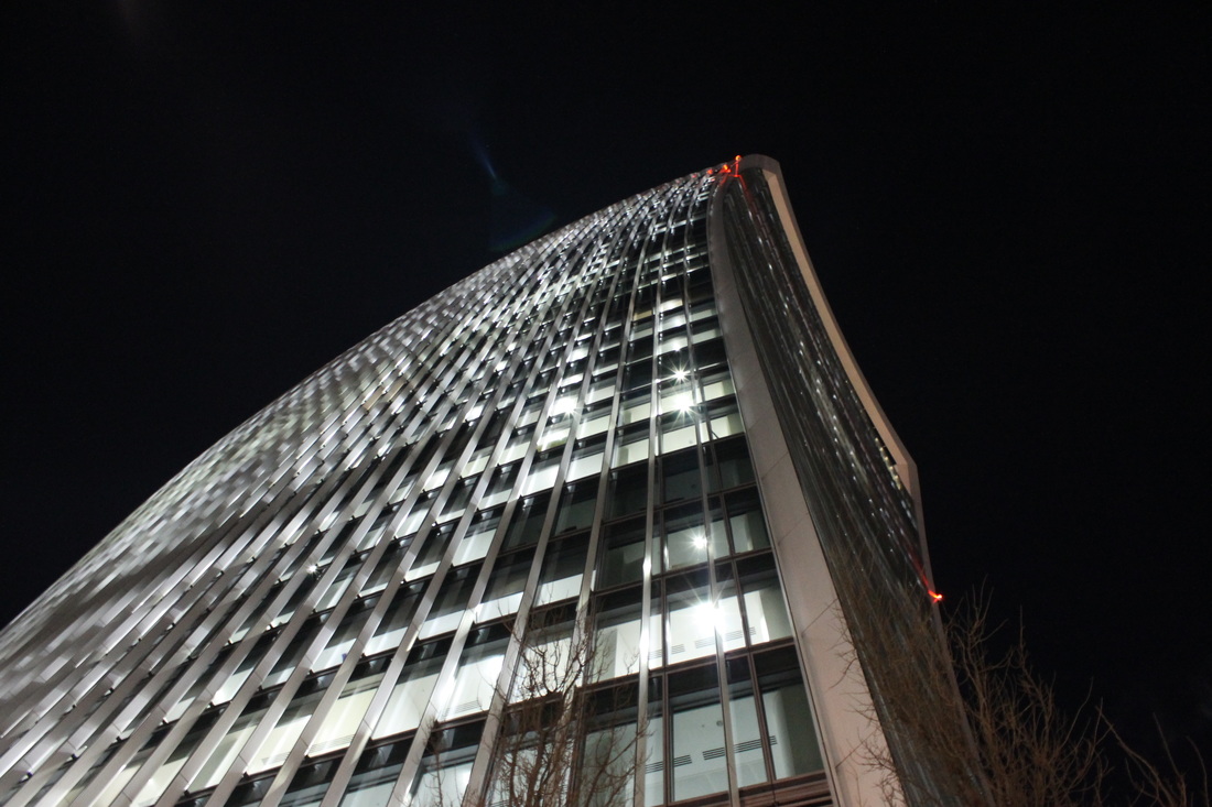
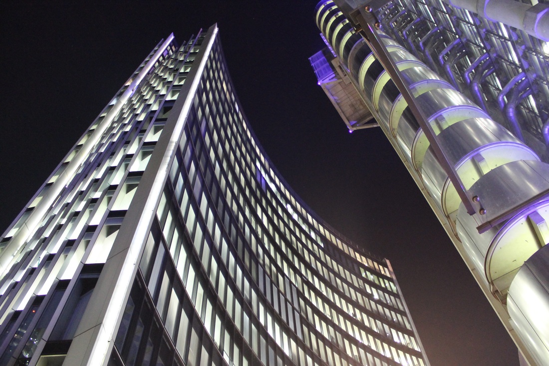
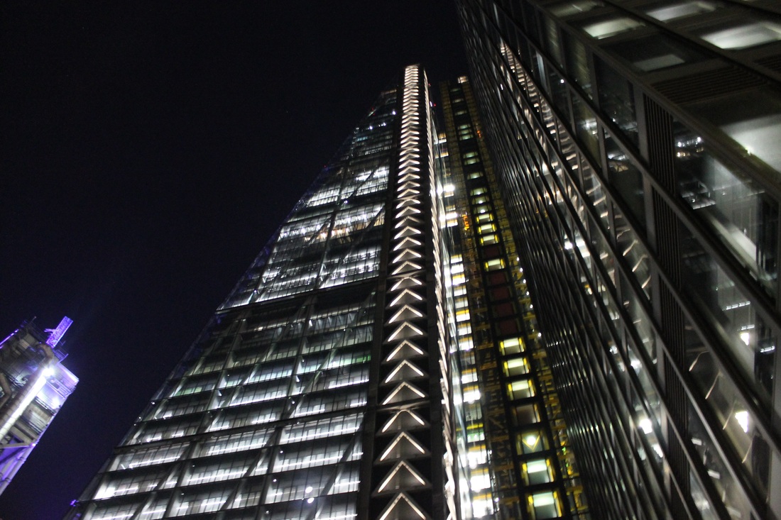
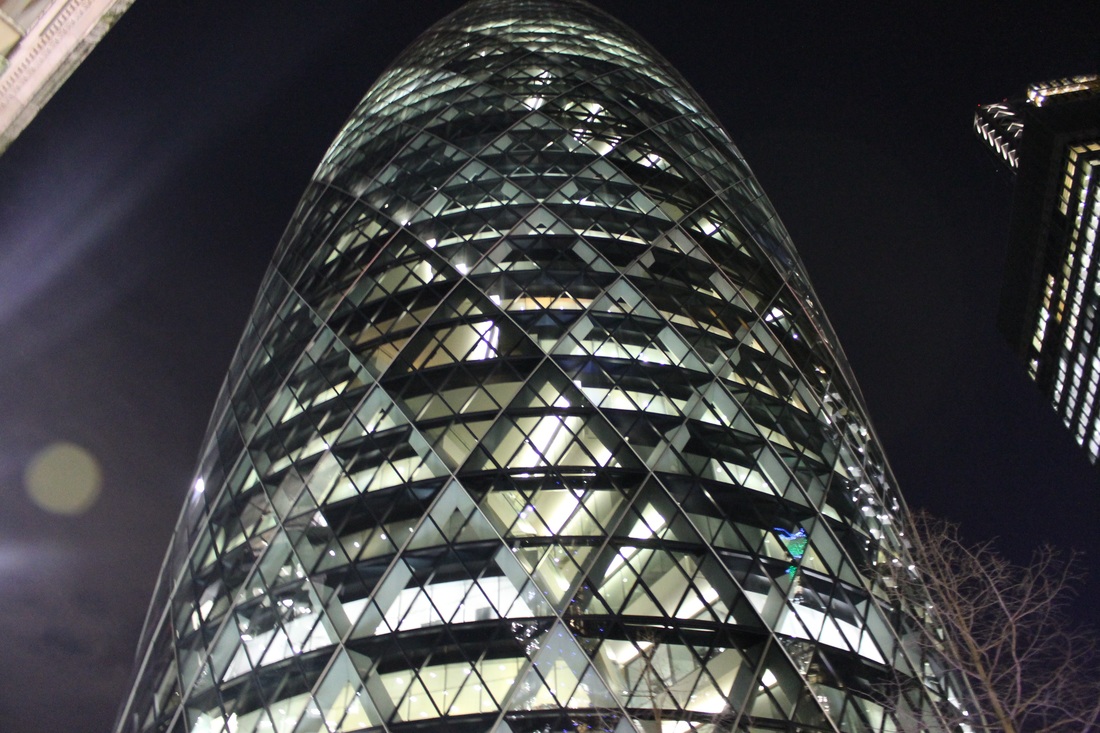
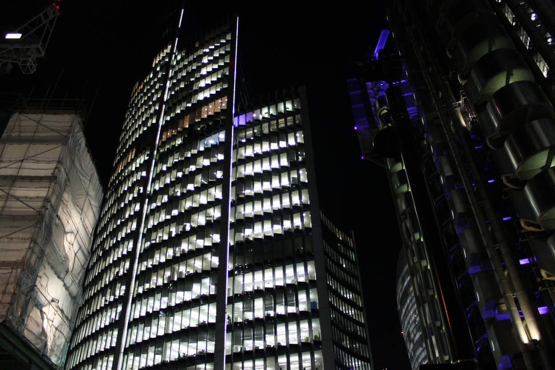
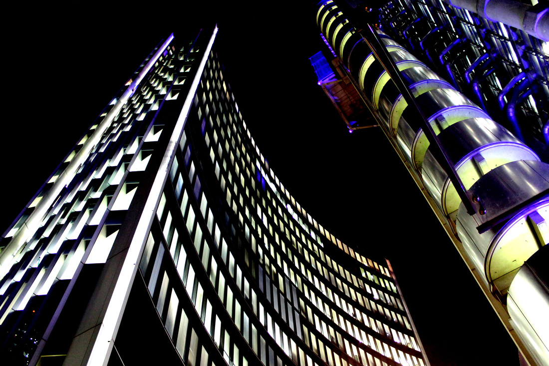
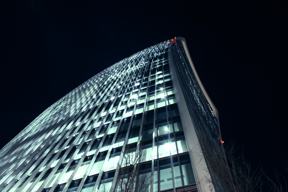
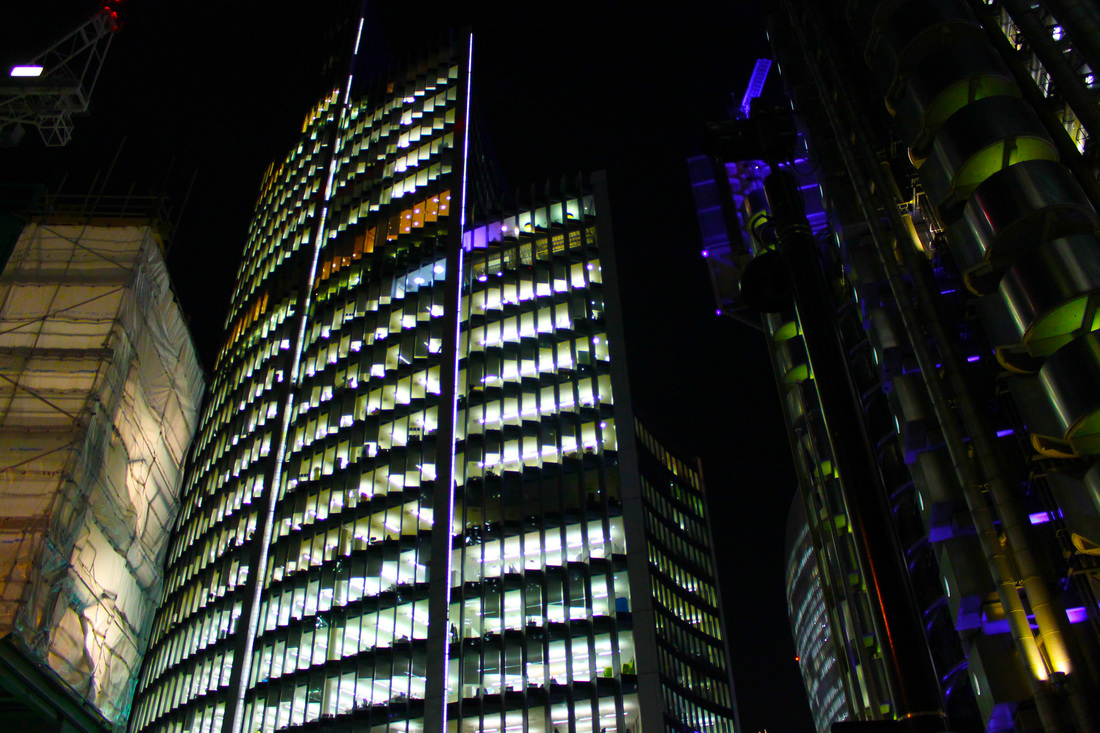
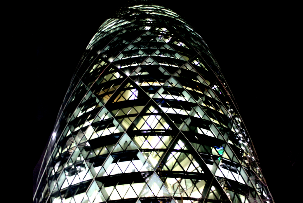
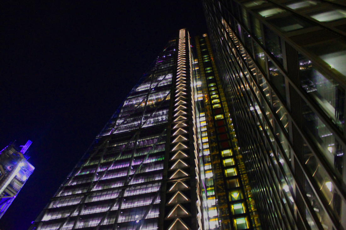
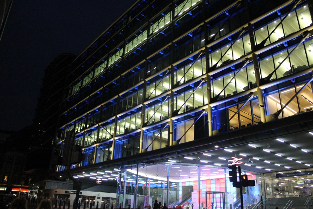
Second Response - Views from Below
For this response I took pictures of buildings from below to show the difference in views from two different heights, these being above and below views.
Final Piece Process :
Overhead and Below Views
Visual Brainstorm-
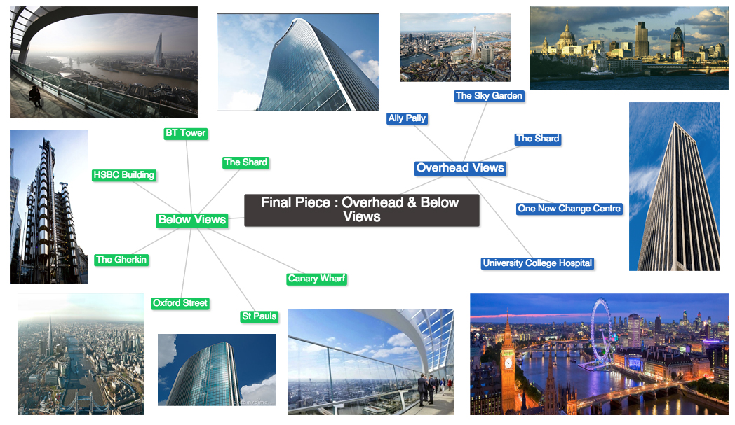
First Response : Overhead Views
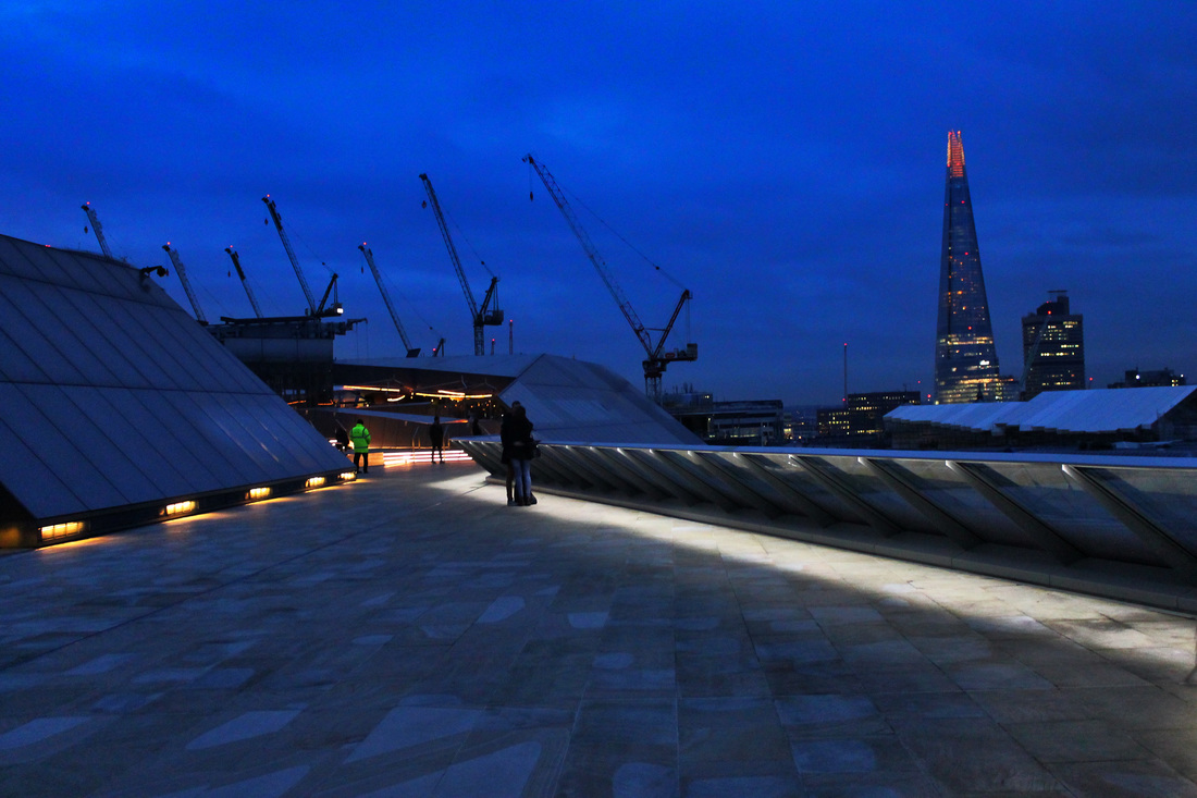
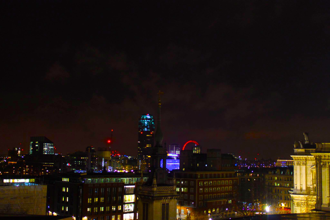
First Development
For this development, I decided to revisit the location that I went to in my above response and photographed the same things again. The reason as to why I went to the same location as before is because the pictures before didn't really show a 'night time' setting which was what my goal was to do. So instead, I went back at a later time in the night and photographed the view in complete darkness in the sky.

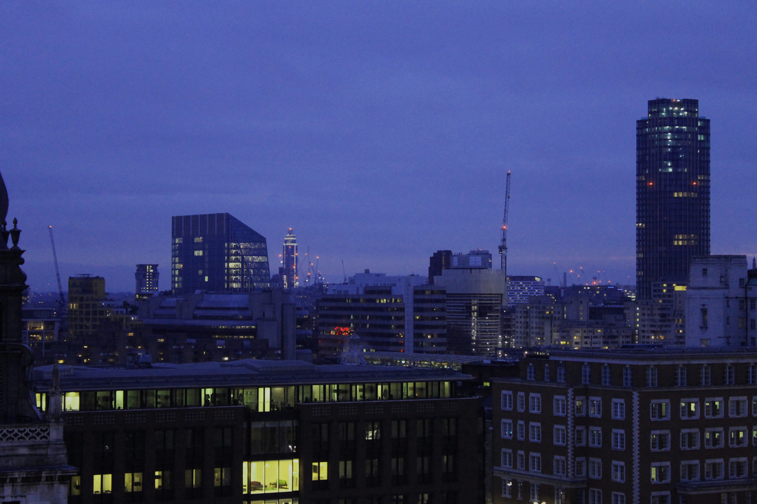
Second Development
For this second development, I revisited the same location as my two above responses in midday so I could show a contrast of how the city looks at different times of the day. In my opinion I prefer these pictures as you can see more of the cities skyline as everything is bright so the photos came out sharper and very clear.
Third Development :
The Monument Tower
For my third development I decided to get another view of the city from a different perspective so I went to the top of The Monument Tower and took pictures of the view.
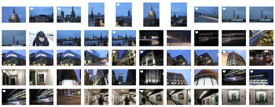
Second Response :
Views from Below at Night
For this response I revisited the previous locations but at night instead. I preferred these pictures to the pictures I took during the day because I like how the lights made the buildings stand out more and have a bright effect against a dark glass.
Selects :
Development :
For my development I wanted to edit the pictures that I chose as my Selected images to present them as clear, vibrant and effective as possible.
Final Piece Editing Process
To show how I edited some of my Final Piece images I put together a screen recording with a fast speed of how I edited the photo on Adobe Photoshop.
Final Piece
For my final piece I have chosen 10 pictures that I have taken during this unit in my final piece process because I feel like they are the best ones that I have shot and the ones that I feel best represent what is meant to be done in this unit. My favourite topic in this unit was 'My London' as I had lots of ideas in mind as to what I wanted to take, I was also really focused and had a really good understanding of what I had to do. My favourite homework task was where we had to go out to a place in London and take photos that represent our chosen theme. My theme that I chose was Movement. I went down to Southbank and took photos of vehicles moving and experimented with many different settings, for example I would change the shutter speed, iso and aperture for different photos, depending on what sort of light I was in. Overall, I really enjoyed working on this unit because every task that was set was very interesting and fun to work on. I also liked when it was the individual strands on "My London" because I could take whatever path I wanted to and I was able to really experiment with the many different pictures that I could take.